
Brand kit
The Talaya brand, how it's built and how to use it. Everything here can be downloaded.
The idea
A watchtower that looks out with you.
Talaya comes from atalaya: the watchtowers that for centuries scanned the horizon along the Mediterranean coast and warned with light of what was coming. That's what it does: it looks out with you, thinks ahead and lets you know.
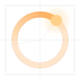
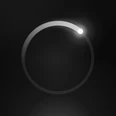
The mark is a ring, both the lens and the horizon, with the beacon on top and the trail of what it has just swept. In the app it's alive: it breathes on standby, trembles with your voice while listening and sends out ripples while speaking.
The product and the assistant have two names. The app is called Talaya. The assistant is called whatever each person likes, and Talaya by default.



Construction
Exact measurements.
Everything derives from the side of the square. These are the same proportions the app, the watch and the lock screen draw it with.
- RingRadius 0.37 of the side. Stroke 0.085. Amber at 28%.
- Beacon50° above the horizontal, at the top right.
- Trail140° behind the beacon. It rises from nothing to 55% over the first 79° and reaches full strength at the beacon.
- Halo2.6 times the stroke, in gold at 55%, fading outwards.
- Dot0.95 times the stroke, in gold.
- Clear spaceAt least the margin the square already carries.
- Minimum size16 px. Below 24 px, prefer the icon.
The icon
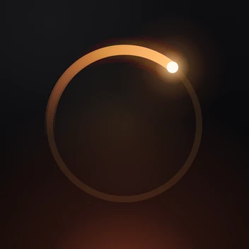
Nightfall, in a square.
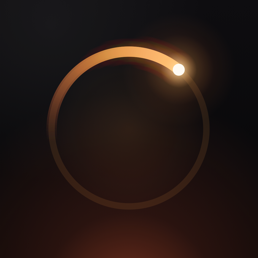
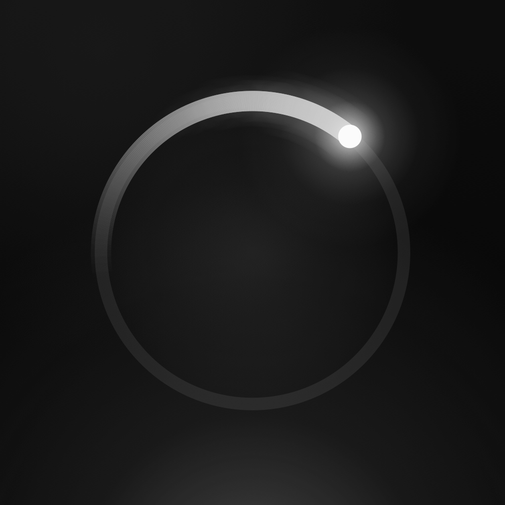
The same ring with a fiery trail and the glow of a horizon at dusk. It's drawn in code at 1024 px, with no transparency, plus its dark and tinted versions for iOS.
Colour
Night and light.
A warm, almost black background, and the amber of the watchtower as the only brand light. Mint is kept for what's happening right now.
#08080AThe background of everything.#121215Cards and solid surfaces.#FFA24AThe brand and its actions.#FF5F3AThe hot end of the fire.#FFD08AThe glow of the beacon.gold, amber, emberThe brand gradient, and the main button.#59F2BFOnly what's happening now: live listening. Never decoration.#F5F1ECMain text, a warm white.#BDB8B0Body text.#8B867ESecondary text. The minimum for AA contrast.Typography
Geist and Geist Mono.
Hierarchy through weight and contrast, not through colour or size. Licensed under the SIL Open Font License 1.1.
Geist · text
Vela por ti.
ABCDEFGHIJKLMNOPQRSTUVWXYZ abcdefghijklmnopqrstuvwxyz 0123456789 & ?! áéíóú ñ
Geist Mono · labels and figures
17:40
LIVE · LISTENING · 120 M · 0123456789
- Headline30, semibold, tracking -0.6
- Body16, regular
- LabelMono 11, capitals, tracking 1.5
The original font files are in the Geist repository. License notice: OFL.txt.
Tagline and voice
Keeping watch. Taking care.
Both lines say both things at once.
English
Looks out for you.
Spanish
Vela por ti.
- Tone
Calm, precise, warm. Short sentences.
- Never
Nothing childish. No emoji. No long or medium dashes: a full stop, a colon, a comma or brackets instead.
Usage
Like this. Not like this.


Downloads
Everything, in one place.
| File | What it is |
|---|---|
| talaya-marca.svg | The mark in colour, for dark backgrounds |
| talaya-logo.svg | Mark and name, in colour |
| talaya-marca-tinta.svg | The mark in a single light ink |
| talaya-logo-tinta.svg | Mark and name in light ink |
| talaya-marca-noche.svg | The mark in night colour, for light backgrounds |
| talaya-logo-noche.svg | Mark and name in night colour |
| talaya-icono.png | The app icon, 1024 px |
| talaya-icono-tintado.png | The tinted icon, 1024 px |